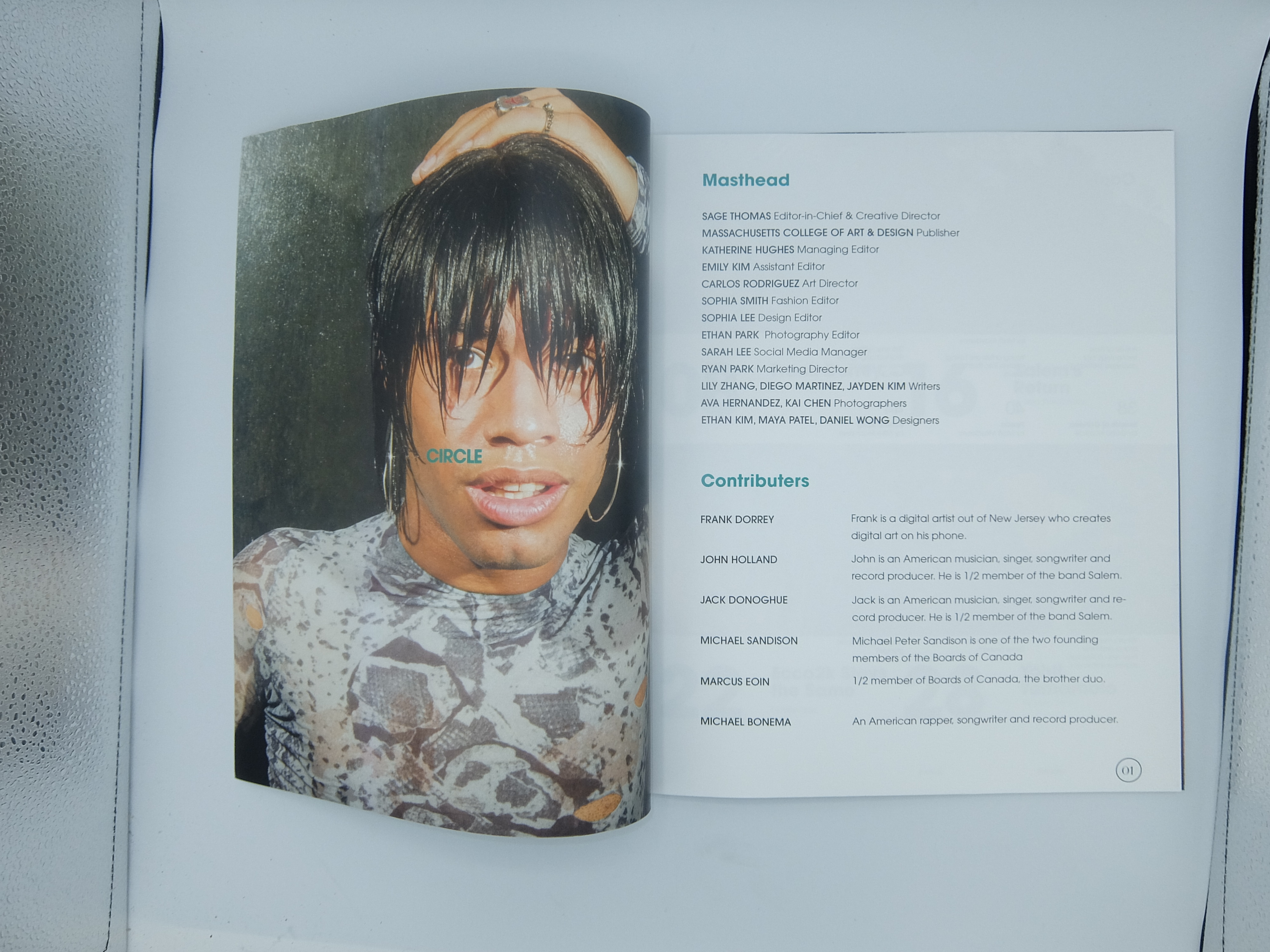
Circle Magazine Issue #123
10in x 12in
Print Design, Typography, Layout Design
Spring 2023
10in x 12in
Print Design, Typography, Layout Design
Spring 2023
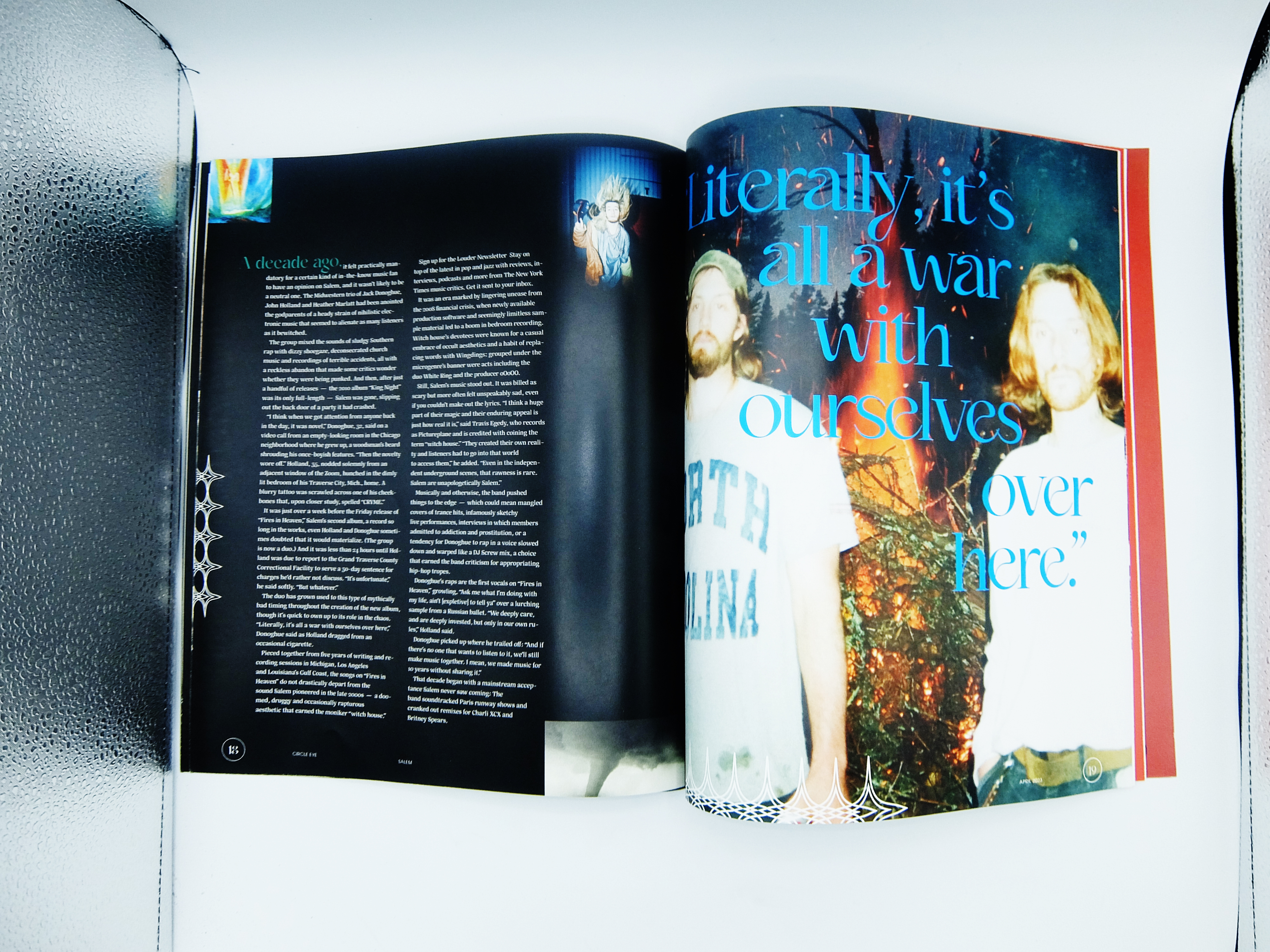
Circle is an experimental (faux) magazine that covers the topics of art, design, and music. Issue 123 is about artists who are pioneers in their field whether it’s digital illustration, avant-garde fashion, or experimental music. The project is a demonstration of typography, layout design, and print design. This magazine intends to stand out from traditional magazines through the use of unique typefaces, stylized images, and interesting layouts. Each issue comes wrapped in a 40-inch poster.
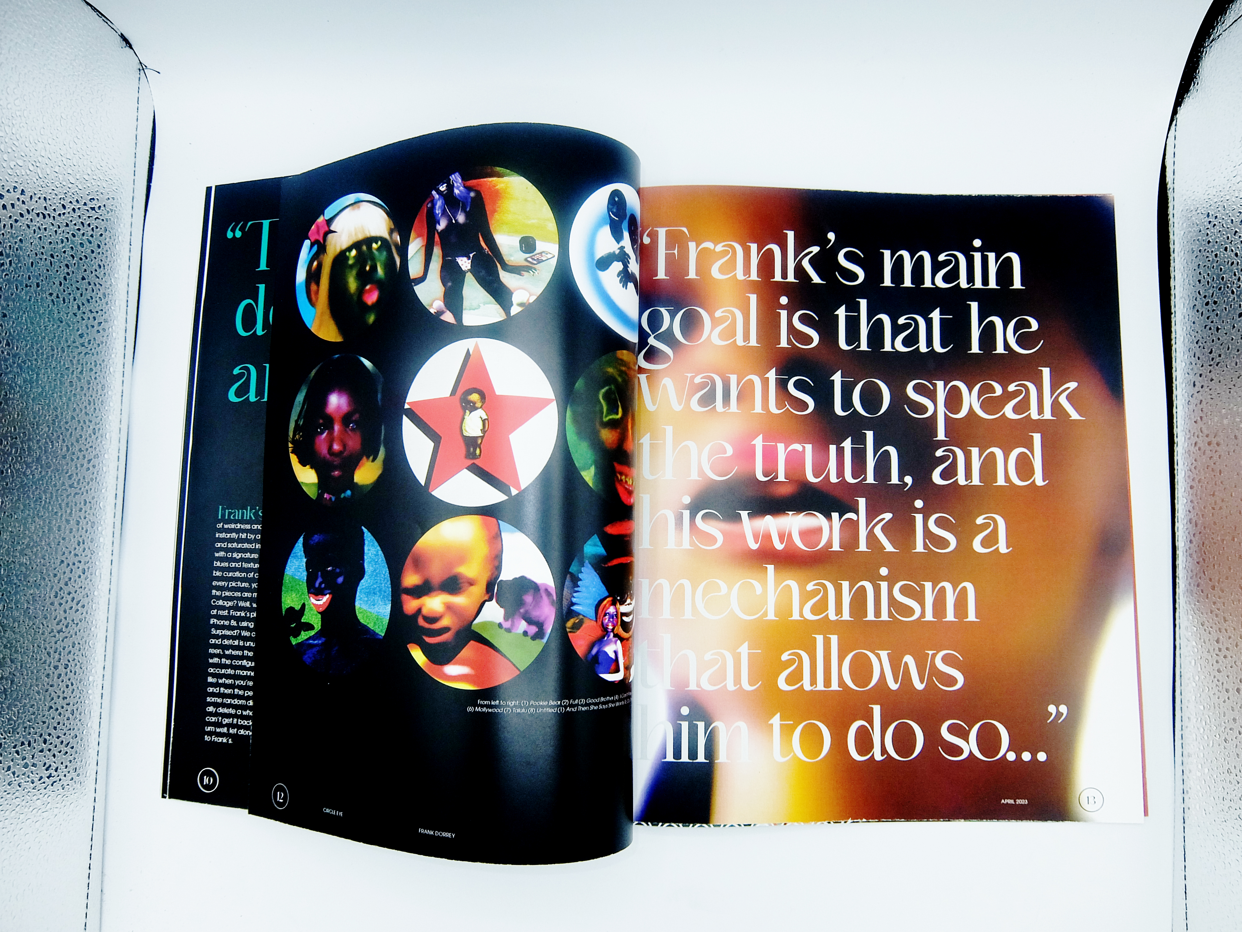
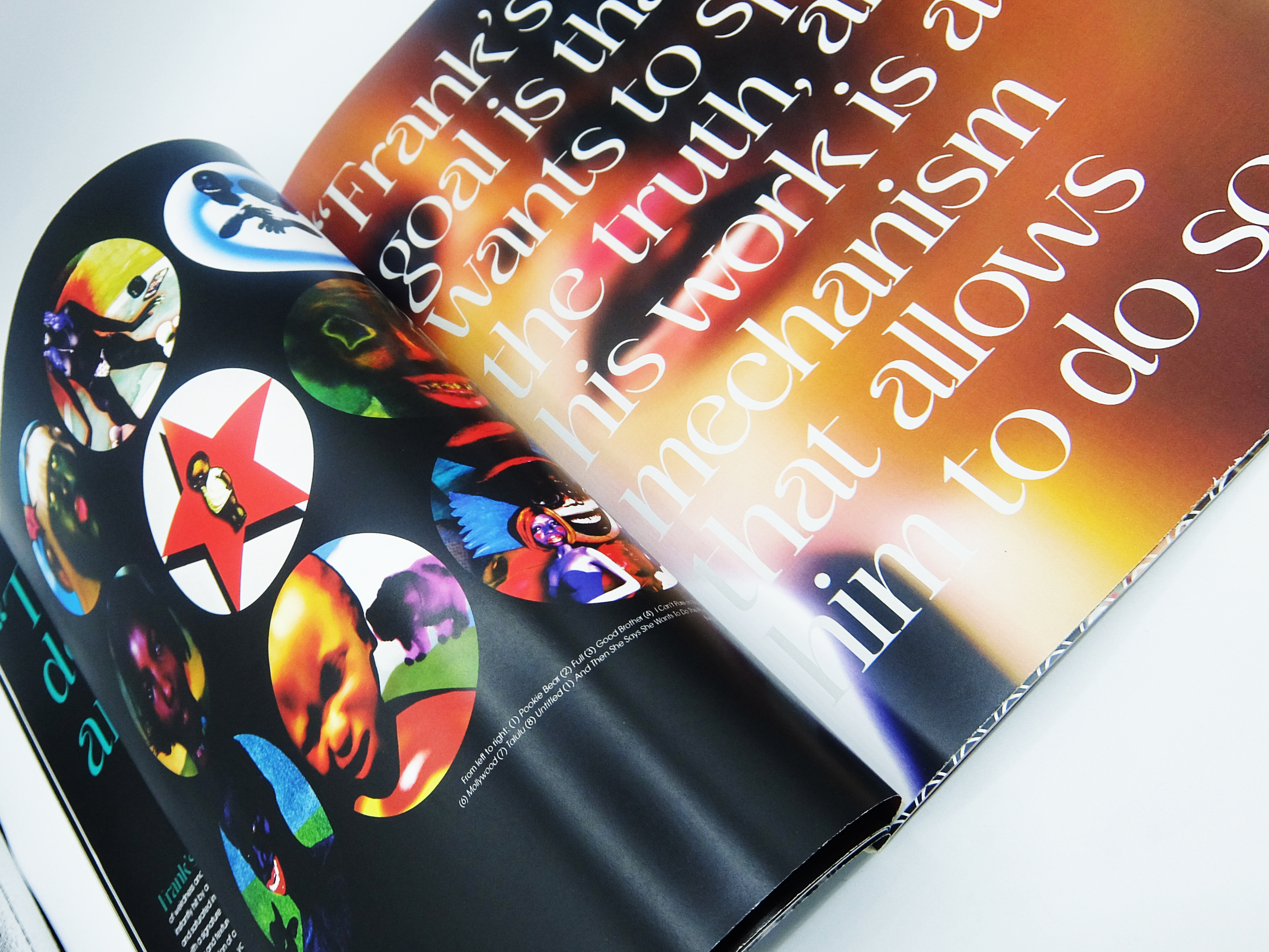
The name Circle came from the idea of art, design, and music connecting with one another. For my primary sans serif typeface, I chose ITC Avante Garde Gothic which has circular letterforms, aligning with the name of the magazine. My secondary serif fonts are Kaftan Serif, a decorative typeface great for large-scale type, and Silva, a highly readable serif font for large bodies of text. For the first page of the Salem article, I used my custom typeface, Stained Glass. I was very focused on curating the imagery and the people involved. Typography and layout were all important, but so was curating the content for the magazine, which I hadn’t spent as much time on in my previous magazine project.
For each issue, there is a circle with a different color on the cover. The color of the circle relates to the main topic or person for that issue. The circle and color become a motif throughout the magazine, in things like headers, lead-ins, or quotes. Quotes play an important role in the magazine, as my focus is to represent the artist and tell their story in an authentic way.